On small screens (tablets and phones, mainly), the default Numbas theme didn’t used to leave much space for the question content.
I’ve spent the past couple of days making the theme responsive, so screens less than 980px wide switch to a more vertical layout. The question menu and pause/end buttons move beneath the content area, and the banner is more vertical too. This means the content area can have the full width of the page.
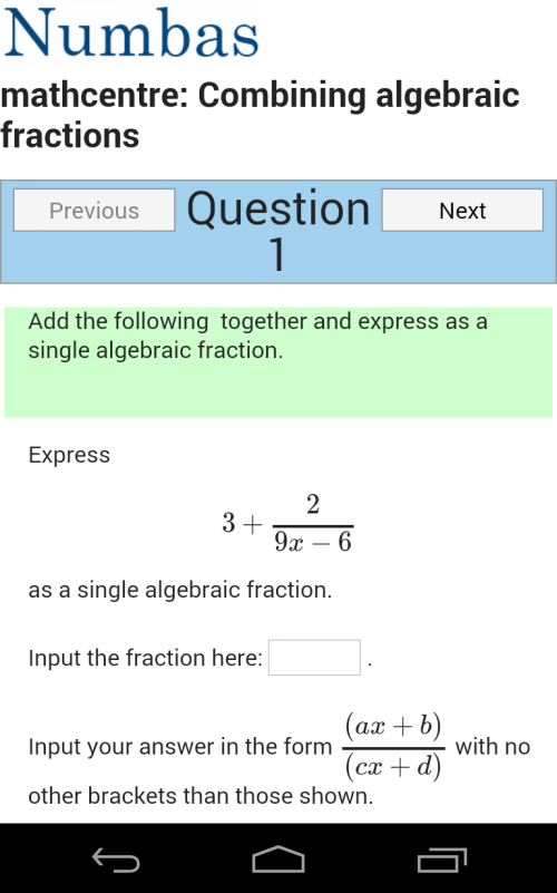
I’ll show you what I mean, using my Android phone. Instead of looking like this…
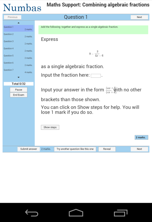
… a Numbas test now looks like this:
The new layout has been tested on Chrome, Firefox, IE9, and various Android and iOS devices. It should work on just about everything, and you shouldn’t notice any big differences on a desktop browser. Try it out for yourself on the Numbas editor!